ShopDreamUp AI ArtDreamUp
Deviation Actions


Comments5
Join the community to add your comment. Already a deviant? Log In
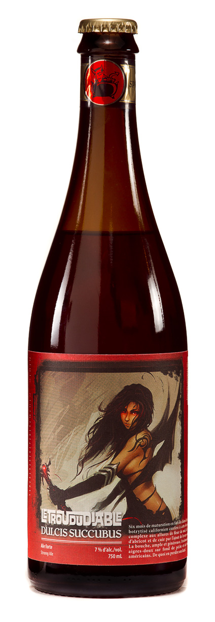
I could not deny the skills of digital painting, it is the most notable part of the piece and important part of the lower part is hidden by the layout. It doesn't make justice to the artwork.
I don't know if you chosen the font for the identity of the beverage, but i think that an interlocked surfer font is not the right choise for a thing called "La Dulcis Succubus" with a fantasy-style illustration. In that matter you are not making the thinks belong to the same context. The same happens if tou compare the glossy finish of the neck label with the matte of the body.
An area like beverage label design, is probably the hardest area to propose something actually new and stunning, it's an area that had been really exploded in any way. So you have to chose if you want to opt to fancy subtleness or stunning efectism. With an illustration like that in the behind i would opt the second one. But offering a regular squarish label was not a wise choise.